


People assume writing a book is the hard part of being an independent author. I used to think that too, before I realized that writing is just the part where you’re alone in a room, having fun creating characters and your own world. The harder part is everything that comes after—the part where you’re no longer alone, but somehow feel more exposed.
Marketing is a strange word for something that mostly feels like guessing. I still haven’t figured it out. But, even before that comes the book cover. Covers are their own particular kind of stress. They aren’t there just to get the book noticed, but to get the book noticed by the right people. Your target audience.
If you get it wrong, the book doesn’t just sit there—it sort of disappears in plain sight.
When I wrote my first novel, Not Famous, I didn’t have the money to hire anyone who knew what they were doing. So I did what a lot of people do when they’re trying to look competent on a budget: I improvised with inexpensive silhouette art, free fonts, and a simple color palette.
The Originals (2019 - 2021)

It wasn’t terrible. It worked well enough for the genre I was writing in, which is its own kind of relief and insult at once. I wanted to appeal to male and female readers, and I thought these covers struck a good balance. However, when I was working on finishing my third novel, I felt a refresh was needed. Mostly, it was the font that bothered me. It felt too cartoony. So, I spent a ridiculous amount of time finding a font that would work.
The First Refresh (2021)
As you can see, the first refresh wasn’t just a font change.

I put more emphasis on the title and reduced the size of the silhouettes. This was very satisfying, like it took some emphasis away from the fact I was using cheap stock art.
The covers were superior, in my opinion, but they didn’t boost sales significantly. Why not? The only thing I could figure out was that the covers didn’t speak to the genre well enough.
The Expensive Fix (2023)
Eventually, I convinced myself I had to make a serious investment and paid for a full redesign to attract the readers I wanted. I decided to hire an illustrator. I researched for a while, trying to find someone who could do what I wanted within my budget. Eventually, I did, and I was excited about the prospect.
How’d they come out? Honestly, I thought they were good, but I wasn’t completely pleased. But I was committed to seeing whether they would do what I hoped and expected.

Unfortunately, the professionally illustrated covers proved an expensive failure.
Trying Again, and Again (2024)
Within a year, I decided to return to my original instinct. Simpler covers, character-focused. Illustrated people on simple, solid backgrounds. No more silhouettes, but full-color characters. A kind of middle ground between “professional publishing house” and “someone figuring it out in real time.”
I hired someone on Fiverr for that phase, and the results were… fine. I thought simple was better, even if the characters weren’t quite aligned with what I saw in my head.

The problem with these covers was that the character felt a little less refined. Still, I felt it was progress.
At some point recently, I hit a wall with trying to get the motivation to start my fifth novel. Part of it concerns personal issues that arose when my fourth novel, Not Prepared, was released. But while I lack the motivation to write something new, I thought revisiting my four existing novels was a good way to get back into things.
The New Covers (2026)
A year and a half later, after barely even thinking about my books, writing, or anything, I decided I needed a refresh. My goal was twofold: to get covers I really loved and to try to rekindle my desire to write.
In a way, the new covers don’t look like a huge leap from the previous iteration. Basically, new illustrated characters to replace the old ones. It may seem like a subtle change, but for me, they were a huge leap.
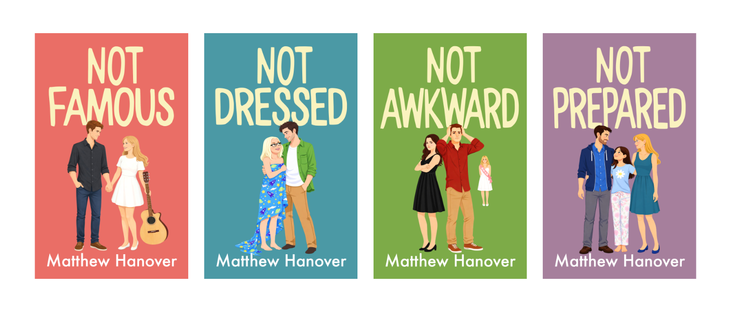
Compositionally, Not Famous and Not Awkward are pretty much the same. But, I decided that having Jake and Kaylee dancing on the cover Not Dressed wasn’t working. So I had to rethink the concept entirely.
Originally, the cover spoke directly to the plot and title: Jake’s girlfriend models nude, and he meets Kaylee at a ballroom-dancing class. I thought about different situations that would work featuring just Jake and Kaylee, but none really tied into the title. I finally came up with the idea of Kaylee wrapped in a geeky bedsheet. And the result was perfect.
The new take on Not Prepared was simpler. A simple composition featuring the three principal characters. Initially, I thought they should be sitting on a couch, just lounging and watching TV… but I didn’t like the idea of introducing such a large prop on the cover, which would also limit how I could use the characters in promotional graphics. So having Neil, Chloe, and Jenna standing together worked nicely.
Once I got the final illustrations back, I plopped them into the previous cover template, and the result was, for me, magical.
There’s a strange moment that happens when something finally starts to feel completely right, and this is where it happened for me. This is the happiest I’ve been with my covers yet. It took a lot of time, money, and work to get them here. Yes, I largely went back to what worked originally (the solid colors and characters), but these new versions hit all the right notes.
The new covers have been in place for a couple of months now, and they haven’t exactly rejuvenated sales, but then again, I haven’t done much beyond some social media promotion. I plan to start more actively promoting them soon.
What do you think of the new covers?